The Parish of Ferragudo has a new Branding, which is «jovial, cheerful, young, current and adapted to new networks and new communication». It was presented on the national holiday of November 1st, the date that marked the 23rd anniversary of its elevation to township.
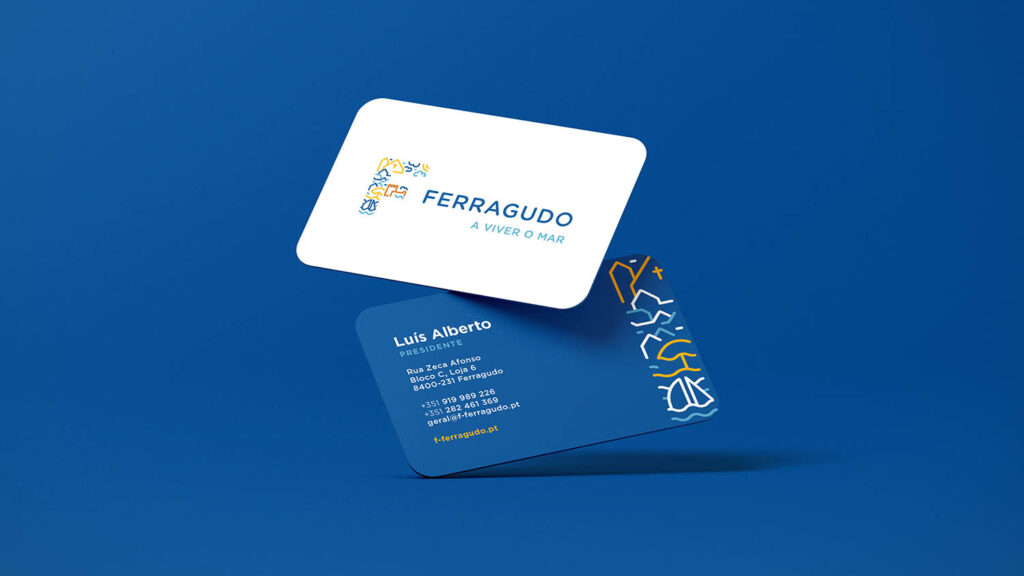
The new logo, to which the claim «Living the sea», integrates the Branding designed by the Algarve company Got it, who was already responsible for the new website and for managing the Parish Council's social networks.
The logo «was designed to celebrate the picturesque side of the village», according to Luís Alberto, president of that municipality. The objective wasextol the tradition of Ferragudo, always with an eye on the future».
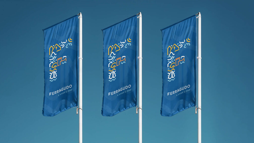
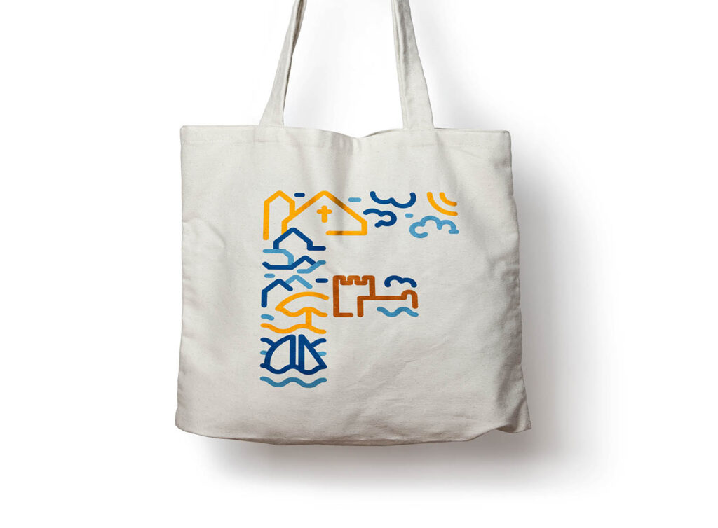
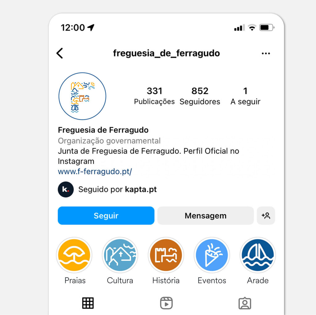
Bruno Simões, CEO of Kapta, explained that, given the diversity of the village, with different points of interest, «we could not take a single element that represented Ferragudo, so we created a union of elements». The result was an F of Ferragudo made up of different elements (monuments, sea, river, beach, streets, sky) and with different shades of yellow and blue.
«The inspiration for the colors came from the typical tones of the region: the blues of the sky and sea, of the boats and the friezes of the houses; the yellow of the sand and the light of a sunny day. Colors that are familiar but still capable of making an impact on the people of your land », he added.
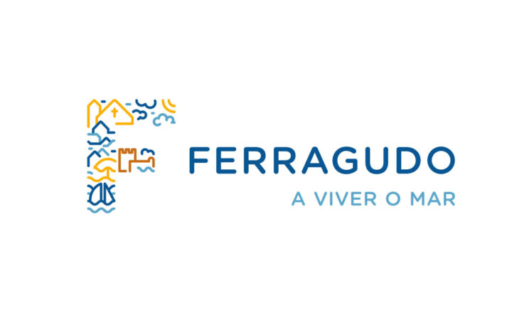
On the other hand, the Kapta team «opted for a smooth typeface, which would meet the lines of the icon: with rounded corners and with a friendly air, like the customers».
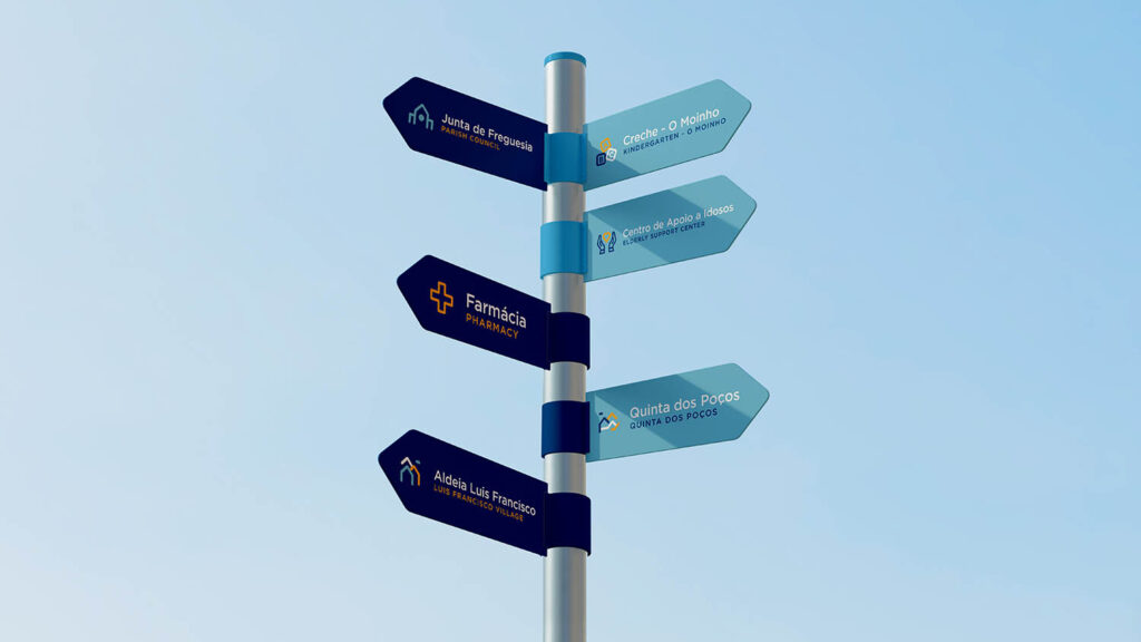
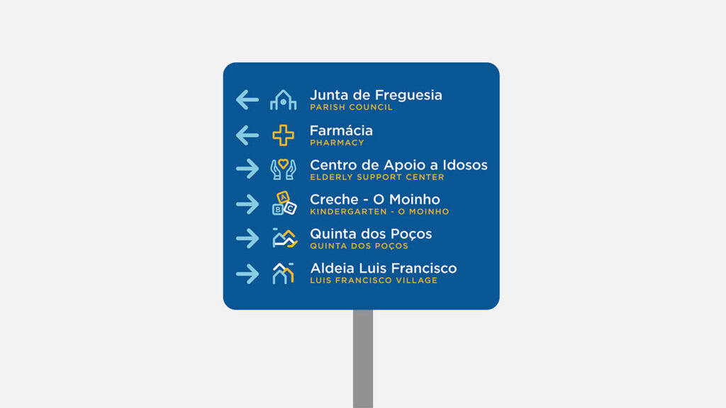
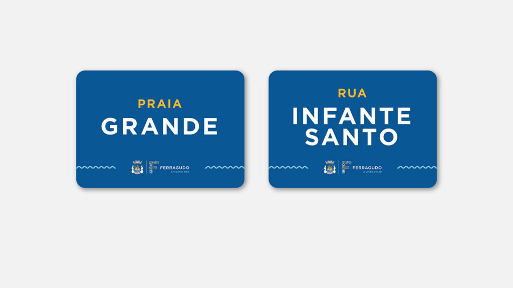
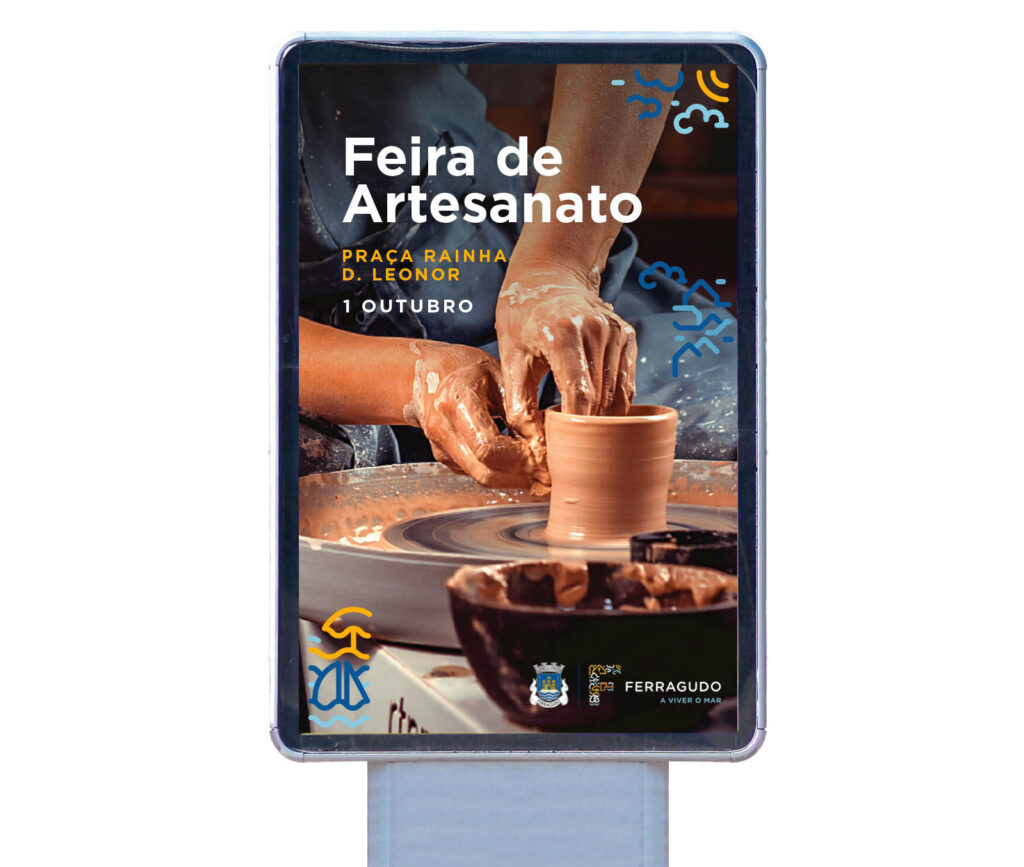
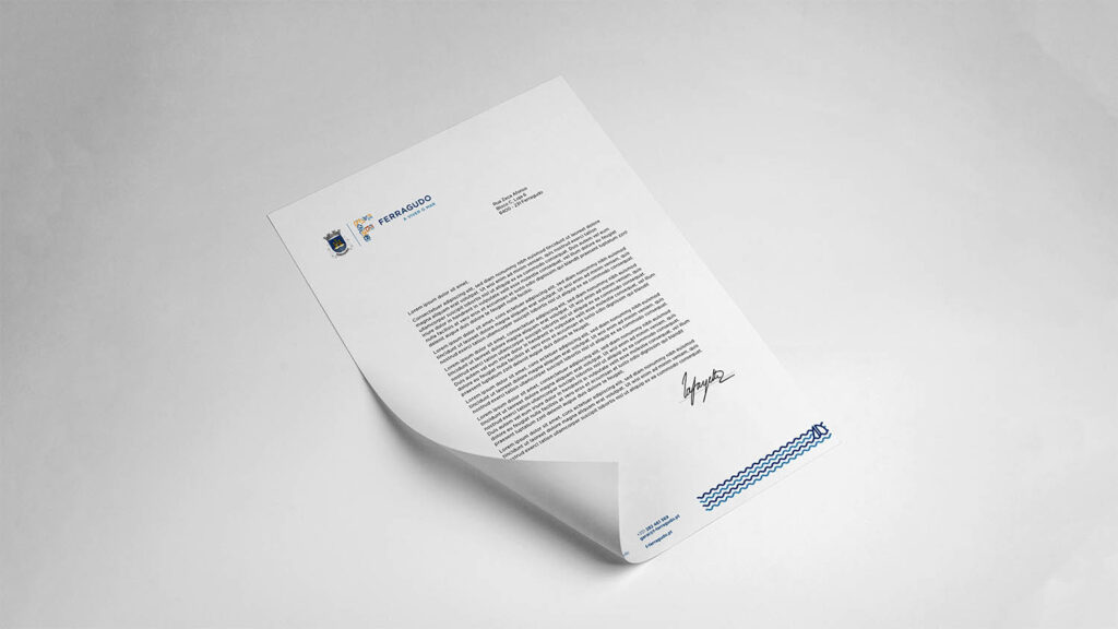
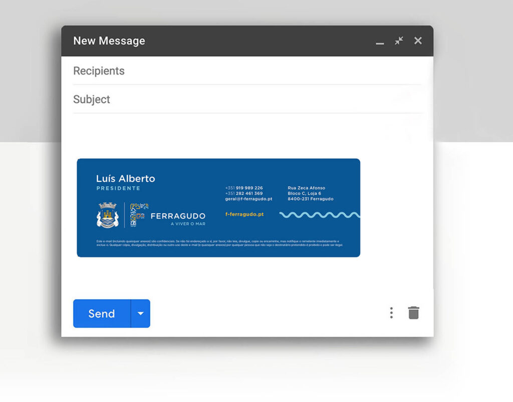
«We went to take the landscape that is Ferragudo and transform it into a logo that can be used as it is, as a whole, or deconstructed into different parts», if necessary apply these elements on t-shirts, in the toponymy of the streets, in signage . «We hope to keep the brand dynamic, through the use of colorful illustrations that adapt to the theme and to the various supports», revealed Bruno Simões.
In fact, the presentation that was made at the former Casa do Compromisso Marítimo, on the afternoon of the holiday, already showed several possible applications, as can be seen in this gallery:
«I've been defending for many years that the image of Ferragudo should be boosted. Some time ago we competed for the 7 Wonders of Portugal and that took the image of the village further, to the whole country», considered, in turn, the mayor Luís Alberto.
«Today, we have streets that are at the top of the most instagrammable Algarve and even Portugal», he added.
Despite this, the president of the Parish Council warned: “don't expect us to implement this so soon in terms of signage and toponymy, because the costs are very high. It won't be right away."
Despite these constraints, the new Branding is already in full use on the social networks of the Parish Council (Facebook e Instagram).


Comments